


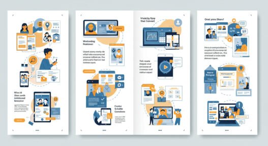

How to Design Stunning Visuals That Convert
The moment someone lands on your website, opens your social media post, or glances at your advertisement, you have exactly 0.05 seconds to make an impression. That’s not a typo—fifty milliseconds is all it takes for users to form an opinion about your visual content. In this lightning-fast digital world, stunning visuals aren’t just nice to have; they’re the difference between a scroll-past and a conversion. Whether you’re crafting graphics for email marketing campaigns or designing landing pages that actually sell, understanding the psychology and mechanics behind visual conversion is what separates amateur designers from revenue-generating professionals.
Most businesses get this backwards. They create pretty pictures first, then hope customers will somehow connect the dots to purchase decisions. But here’s what industry leaders at companies like Apple, Nike, and Airbnb have figured out: conversion-focused design starts with understanding human psychology, then builds visuals that guide specific behaviors. The most successful email marketing campaigns don’t just look good—they’re engineered to move people through a carefully orchestrated visual journey that feels effortless yet inevitable.
The Neuroscience Behind Visual Conversion
Your brain processes visual information 60,000 times faster than text, which explains why a poorly chosen color palette can tank conversion rates before visitors even read your headline. When designing for conversion, you’re essentially creating a visual argument that bypasses rational thought and speaks directly to the limbic brain—the part responsible for emotional decision-making and, ultimately, purchases. 
Consider how Spotify revolutionized music discovery not through better algorithms alone, but by wrapping those algorithms in visuals that feel personal and emotionally resonant. Their annual “Wrapped” campaign generates billions of social shares precisely because it transforms data into visually compelling, shareable stories. This same principle applies whether you’re designing Instagram ads, website headers, or email marketing templates that need to stand out in crowded inboxes.
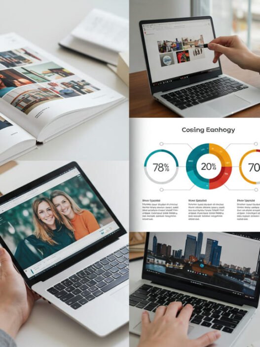
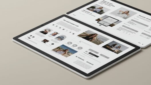
The most effective visual designs create what psychologists call “processing fluency”—the ease with which your brain can understand and act on information. When Slack redesigned their interface in 2019, they didn’t just make it prettier; they reduced cognitive load by 40% through strategic use of white space, consistent iconography, and intuitive color coding. The result? User engagement increased by 32% within six months, proving that beautiful and functional aren’t mutually exclusive—they’re essential partners in conversion optimization.
Color Psychology: The Silent Salesperson
Color choices can increase brand recognition by up to 80%, but most designers treat color selection like aesthetic decoration rather than conversion strategy. The truth is, colors trigger specific psychological responses that can either accelerate or sabotage your sales process. Red creates urgency and excitement—perfect for limited-time offers in email marketing campaigns—but use too much and you’ll trigger stress responses that drive customers away.
Blue, the world’s most popular color, builds trust and reliability, which explains why financial institutions like Chase, American Express, and PayPal built their brands around various blue palettes. However, blue can also feel cold and corporate when overused, potentially reducing the emotional connection necessary for impulse purchases. The key lies in understanding color context and cultural associations.
Take Tiffany & Co.’s iconic robin’s egg blue, which has become so synonymous with luxury and exclusivity that the company actually trademarked the specific shade. This isn’t accidental—that particular blue triggers associations with clear skies, precious gems, and aspirational lifestyle imagery. When you see that blue in advertisements or email marketing communications, your brain immediately assigns premium value to whatever product it’s showcasing, often before you’ve even processed the actual offer.
Smart designers create color hierarchies that guide attention naturally. Your primary action button should pop visually from the rest of your design, while secondary elements recede into supporting roles. Conversion optimization experts at companies like Unbounce have found that changing a single button color can improve click-through rates by 21% or more, but only when that color choice aligns with the overall psychological journey you’re creating.
Typography That Commands Attention and Action
Typography is the voice of your visual design, and like any voice, it can whisper, speak, or shout depending on your strategic choices. The fonts you select communicate personality, credibility, and urgency long before anyone reads your actual words. Sans-serif fonts like Helvetica and Arial project modernity and cleanliness—perfect for tech companies and minimalist brands—while serif fonts like Times New Roman and Georgia convey tradition, authority, and trustworthiness.
But here’s where most designers go wrong: they choose fonts based on personal preference rather than conversion psychology. The most effective email marketing campaigns use typography hierarchies that create visual scanning patterns, guiding readers from headline to call-to-action in a deliberate sequence. Your eye naturally follows certain paths across any visual composition, and strategic typography placement can either support or disrupt this natural flow.
Medium, the publishing platform, revolutionized online reading experiences by optimizing every typographic detail for engagement and completion rates. They discovered that increasing line height by just 0.1em improved reading comprehension by 8%, while their custom font choices reduced eye strain during long-form content consumption. These seemingly minor adjustments resulted in significantly higher time-on-page metrics and, ultimately, more newsletter subscriptions and premium conversions.
The spacing between letters, words, and lines affects readability more than font choice itself. Cramped text creates anxiety and cognitive overload, while overly spacious layouts can feel disconnected and hard to follow. Professional designers use mathematical ratios—often based on the golden ratio or modular scales—to create typography that feels harmonious and easy to process, even when readers aren’t consciously aware of these design decisions.